About
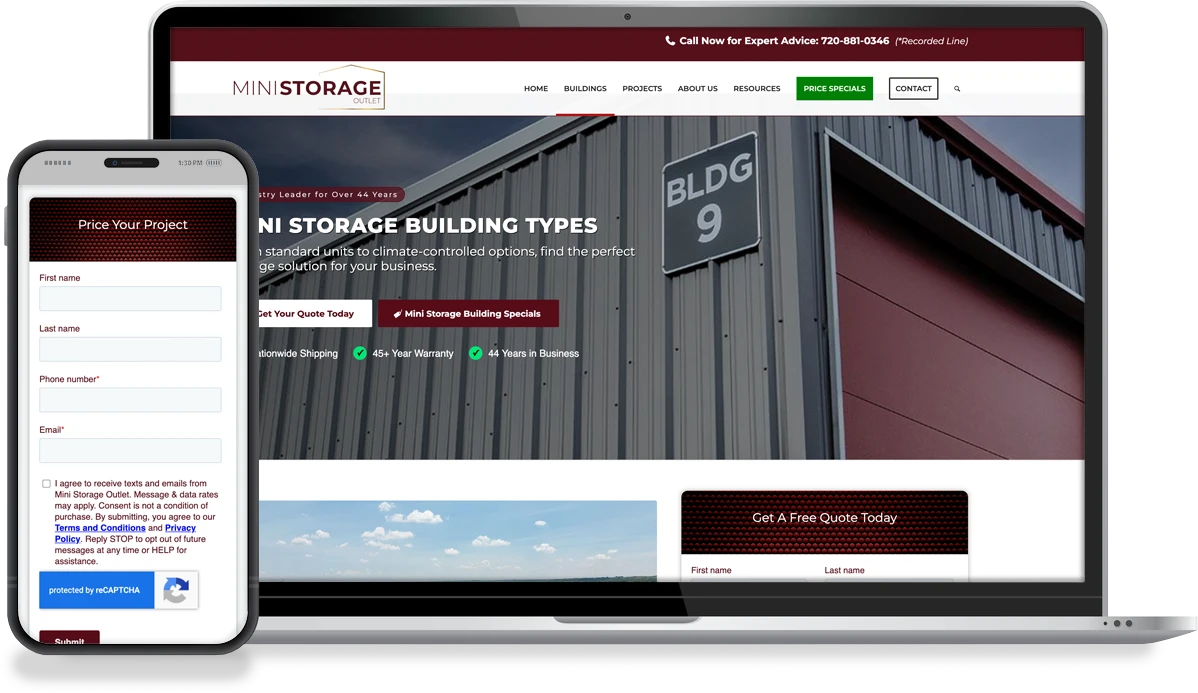
Mini Storage Outlet supplies self-storage building components and solutions to customers planning, constructing, and expanding storage facilities. Its website serves buyers who need detailed product information before they are ready to request pricing or speak with the team.
Challenge
Product pages were doing an important job: giving prospective customers the technical and purchasing information needed to evaluate Mini Storage’s solutions. But the depth of that information also created friction. As users scrolled through lengthy content, the site’s primary conversion opportunities became less visible.
Behavioral analysis showed that visitors were consistently reaching product-level pages, then abandoning their sessions without progressing. The issue was not necessarily a lack of interest. High-intent users simply did not have a clear, persistent path to call the company or request a quote once they moved deeper into the page.
Mini Storage Outlet needed to make conversion easier without stripping away the product detail customers relied on—or committing to an unnecessary sitewide redesign.
Solution
OuterBox began with evidence rather than assumptions. Microsoft Clarity and Google Analytics 4 were used to map entry points, identify the highest-traffic pages, and examine where visitors disengaged. That research narrowed the opportunity to product pages, where intent was strong but progression was weak.
Diagnose the behavioral gap
Session behavior and analytics revealed a disconnect between content consumption and conversion. Users could explore the information they needed, but the actions that moved them toward a sales conversation were not consistently available throughout that experience.
Build a focused hypothesis
OuterBox hypothesized that persistent access to the two most useful next steps, calling or requesting a quote, would reduce friction and help more product-page visitors act when they were ready.
Design a persistent conversion path
The team developed a sticky banner for product-level pages with two clear actions: click-to-call and direct navigation to the quote form. The banner remained visible as users scrolled, keeping a conversion opportunity within reach without interrupting their product research.
Validate the change through experimentation
The sticky-banner experience was tested against the baseline site experience for over 30 days using Convert. This allowed the team to measure the effect of the change rather than relying on before-and-after observation alone.
+267.31%
Quote Submissions Increase
3.67%
More Quote Requests Than the Original Pages
Results
During the 30-day test, the sticky-banner experience produced a 267.31% increase in quote form submissions compared with the baseline experience. Put another way, the tested experience generated approximately 3.67 times the baseline submission volume or quote requests than the original pages.
The result showed that visitors did not need less information. They needed a clearer way to act while consuming it. By keeping click-to-call and quote options visible throughout the product journey, Mini Storage Outlet converted more existing interest into measurable sales opportunities.
How Convert Fits the CRO Workflow
Behavioral tools helped OuterBox identify where users were getting stuck; experimentation determined whether the proposed solution actually improved performance. Convert served as the controlled testing layer between insight and implementation—allowing the baseline and sticky-banner experiences to run against the same conversion goal.
- Clarity revealed how visitors interacted with long product pages.
- GA4 identified high-traffic entry points and broader journey drop-off.
- Convert enabled a controlled comparison of the original and sticky-banner experiences.
- Quote form submissions provided a business-relevant primary outcome, rather than relying only on CTA clicks or engagement signals.
That separation matters. Research can produce a strong hypothesis, but a controlled experiment establishes whether the experience—not seasonality, traffic mix, or intuition—drove the result.
Why the Test Worked
The test worked because it addressed a specific point of friction without disrupting the product research experience. Mini Storage’s detailed product content was valuable, but as users moved deeper into the page, the primary conversion opportunities disappeared from view. The sticky banner kept the next step visible throughout the journey.
Offering both click-to-call and quote request options also supported visitors at different stages of readiness. Users prepared to speak with the team could call immediately, while those still comparing options could move directly to the quote form.
Most importantly, the solution was focused. Rather than redesigning the entire site or removing useful content, OuterBox identified the moment where high-intent visitors were losing their path forward and tested one targeted change. The result demonstrated that visitors did not need less information—they needed an easier way to act on it.
The Business Impact: More Value From Existing Demand
The test increased the number of visitors raising their hands for a quote, creating more opportunities for Mini Storage’s sales team without requiring the company to first increase traffic. It improved the yield from demand the site was already attracting.
The winning idea also created a repeatable UX principle for other high-intent pages: detailed content and conversion do not have to compete. When users can access the next step at the moment they are ready, the site can educate thoroughly and convert effectively.
For Mini Storage Outlet, one targeted CRO experiment turned a hidden progression problem into a 267.31% lift in quote submissions, and demonstrated how behavioral research, focused UX, and controlled testing can translate directly into pipeline opportunity.