 By: Craig Smith
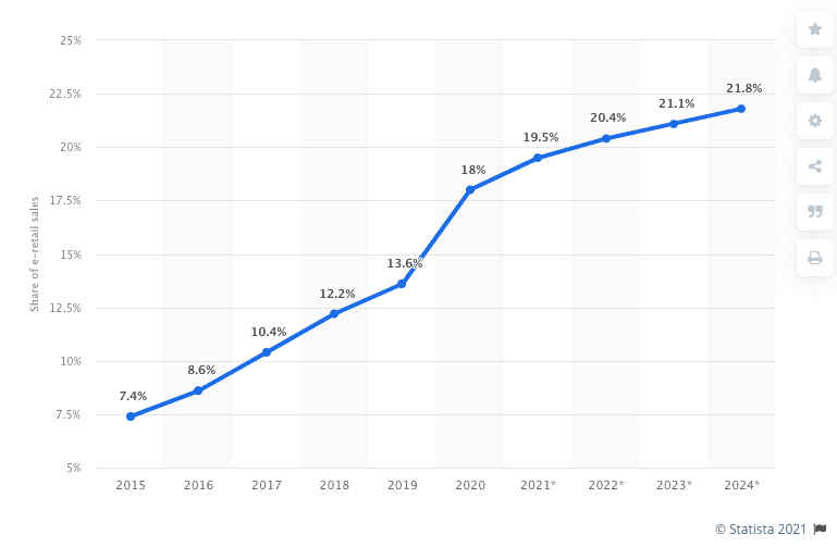
In an ever-expanding demand for online shopping, it’s essential that your brand keeps website experience top of mind. And after a year in a global health crisis requiring more time at home, the need for an effective, attractive website was only amplified. In fact, online sales account for 19% of all retail sales, and that number is only expected to climb.
But if your customers can’t quickly and easily find your products, they’re likely to abandon their search on your site. That’s why your navigation presentation is of utmost importance in determining whether or not a potential customer will make a purchase on your site.
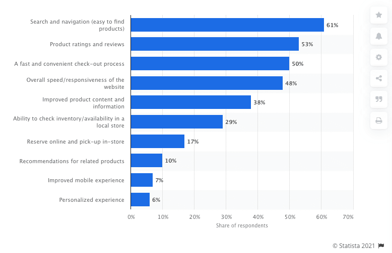
According to Statista, when asked what the most important attributes of the online shopping experience are, 61% of respondents answered “search & navigation”.
Over half users spend less than 15 seconds on a page, which means users need to know where to take their next step quickly, or you lose an opportunity to turn a visitor into a customer.
Or in other words, if you don’t get navigation right, nothing else will go right, either. In this blog post, we’ll explore four best practices in website navigation this year and highlight some sites that get it right.
Best Practice #1: Your navigation is accessible
Accessible design is the framework of any good navigation. Making sure every user (including those with disabilities) can access your products is important. All potential users should be able to navigate your website. This includes concepts such as appropriate color contrast and font size. To find out how accessible your site is, we recommend reviewing this checklist.
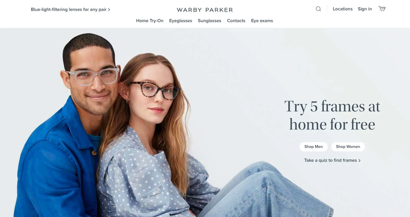
Your navigation should also be presented consistently on every page. If it’s located at the top of the page on your homepage, make sure that’s exactly where it’s located everywhere else. This takes out potential frustration of a customer who wants to know exactly where to turn next.
Best Practice #2: Your navigation is clear and helpful
Taking the guesswork out of where to find a user’s next steps is one of the best gifts a designer can give a user. The goal here is to present the next step solution without the user having to even ask the question.
Intuitive Navigation
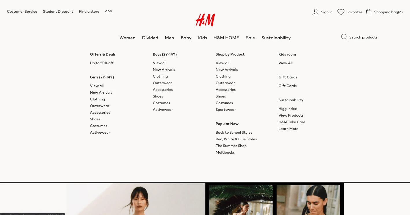
Products should be intuitively placed within product categories and allow users to easily discover the category or product they’re looking for.
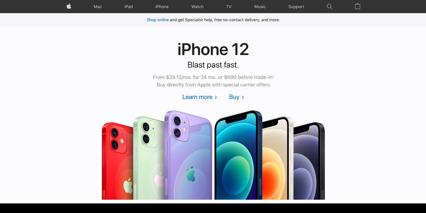
Often, brands present indicators to help users identify what page of the site they’re currently on. This can be done through underlining, bolding, or displaying the link in a highlight color.
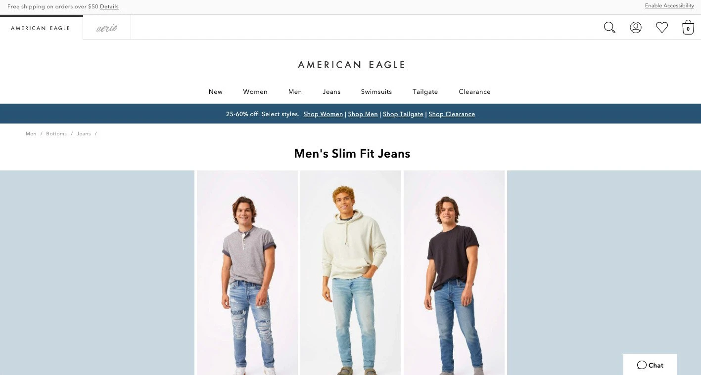
Breadcrumbs
Another very helpful tool to use in your navigation are breadcrumbs. A website breadcrumb is a trail type navigation element that a user can use to maintain awareness of their locations on a page. This is a helpful option when a user would like to view other categories without needing to click the “back” button and risk losing any progress they’ve made. Breadcrumbs are also vital for maximizing your ecommerce SEO potential – providing those keyword specific links that Google loves.
A clean, simple navigation can go a long way towards increasing conversions. Avoid distractions and unnecessary extra graphics, and only include a reasonable amount of links. Too many options without any hierarchical presentation will lose visitors.
Best Practice #3: Your navigation is responsive
This year, over half of online purchases will be conducted by a mobile device (up almost 20% since 2017). Being “mobile friendly” is no longer just a “nice to have”; it’s essential for a brand to thrive.
In fact, if a user leaves your site because of a poor navigation experience, you not only lose that customer, you also take a hit in your ranking in SEO.
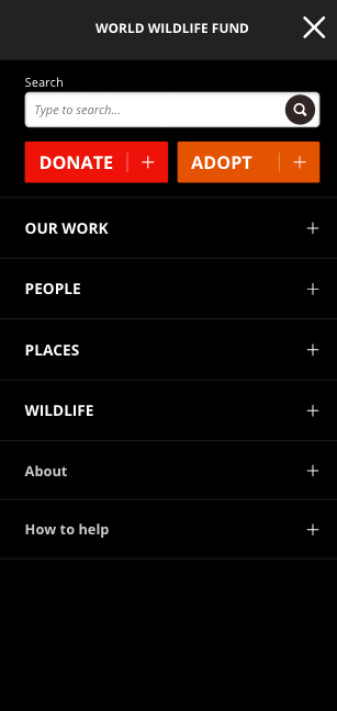
Since screen space is limited on a mobile device, communicating how to take the next step is essential. Often times, brands default to a collapsed menu presented as a “hamburger” menu. This frees up space while also being incredibly accessible for the users.
Of other importance in a mobile presentation is to make sure to allow users to see subcategory pages along with higher category pages. This can be done well, especially with a clean navigation and clear hierarchy. Using the most frequently searched terms within your navigation will have a compound effect as well on your ecommerce SEO performance.
Ensure users can effectively use your navigation and avoid mis-clicks by considering the amount of clickable space. Navigation links should be at least 42px tall to allow accurate selections.
Best Practice #4: Your navigation includes a search option
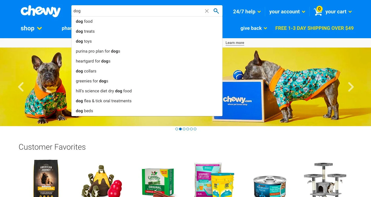
Search bars are integral to your navigation approach, but they’re often easily overlooked. In fact, up to 30% of users will utilize site searches. And according to a study by eConsultancy, visitors utilizing the search function were 1.8 times more likely to convert than an average visitor.
Easily Located
Make sure your search function is easily accessible and user friendly by making sure the search bar is easily located in the same place on every page. This includes using a simple magnifying glass icon box to help users find the search area.
Auto-Populated Content
Auto-populating search content improves overall website satisfaction, creates an easier way for users to convert, and reduces the possibility of typos when searching for an item. And more than just being helpful for a user, you’ll also gain important insight into which items are most searched for, which you can turn into actionable insights to increase conversions.
Next Steps
So, now what? Below are three steps to take to improve your website experience.
#1 Assess
First, we recommend critically assessing your navigation presentation on your website. What areas are you following best practice guidelines? What things might you do to improve your navigation to drive better results?
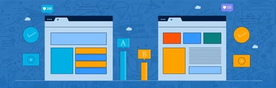
#2 A/B Test
Second, OuterBox recommends running A/B tests on your navigation. Testing how well your site performs is essential to making sure you’re meeting the needs of your customers, and you can’t be sure what presentations might perform better unless you test them. And without providing an effective navigation presentation on your site, you’re leaving revenue on the table. We recommend running an A/B test with a different variation of navigation displays to ensure data driven insights into how to make your website more effective.
#3 Connect with OuterBox
Finally, if you’re interested in learning more, make sure to contact us for a consultation. Our team will provide you with a live website review to help you understand what digital growth opportunities exist in your business.
Ready to improve your navigation? Let’s get started.
