1. Approach
Reimagined Checkout Experience
This client wanted OuterBox to look into ways to help improve the design and functionality of their checkout to reduce bounce rate and improve the overall conversion rate on the website.
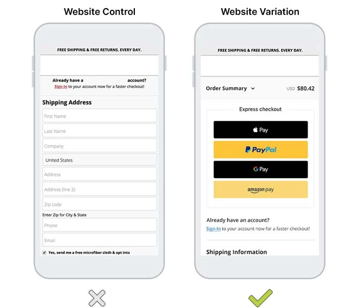
To achieve this, OuterBox utilized our standard qualitative and quantitative efforts to decide on the best areas to improve within the checkout. We set up heat-maps to provide data into how users were scanning the checkout, which leveraged our optimal decision making. After designing a new checkout, OuterBox A/B tested both to see which performed better.
2. Results
Increase in phone calls
The test confirmed that this client’s checkout was due for an improvement. The new checkout design led to an overall conversion rate increase of 5% on both tablet and mobile devices (desktop increased slightly).
Now, this client not only benefits from increased revenue, but they also have a more modern and up-to-date checkout design that follows standard design and UX best practices. This makes the checkout experience much more streamlined and user friendly.
5%
Increase in phone calls
