By: Craig Smith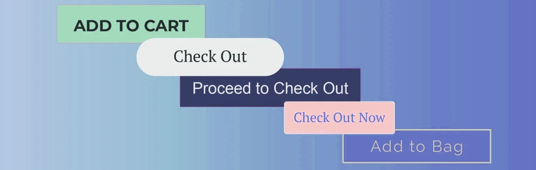
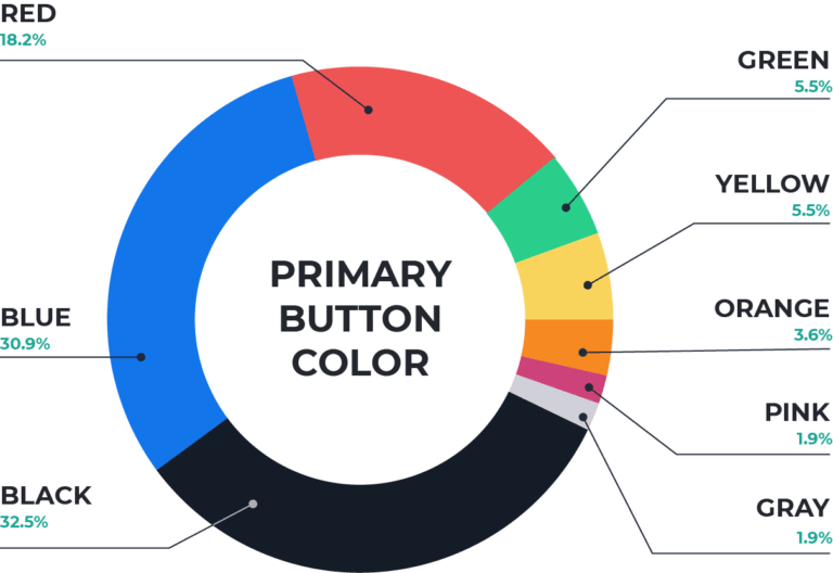
Why So Much Blue and Black?
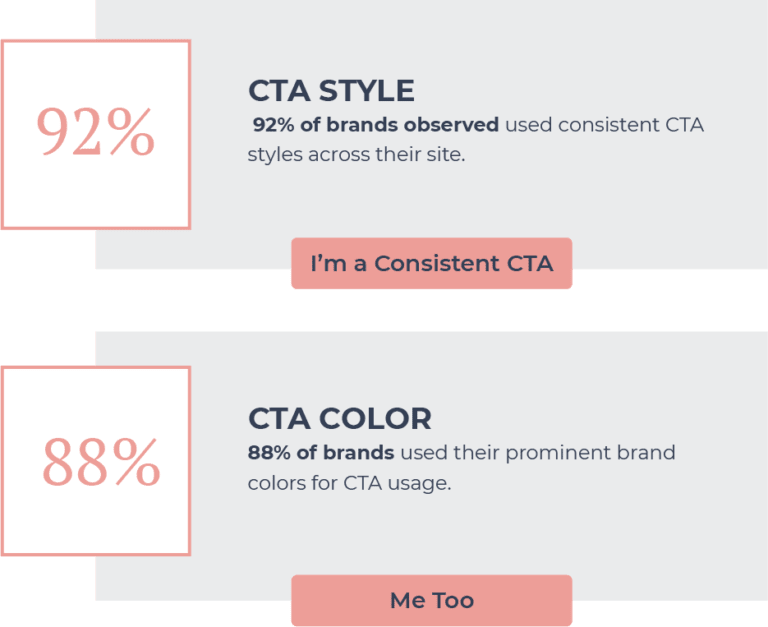
We have all read it at some point — the article explaining the psychological influence of certain colors. Are people leveraging a blue button because it conveys trust, calm, and inspiration? Not necessarily. During our observation, we noted over 88% of buttons were aligned with the store’s branding. Those that were not direct brand colors appeared to be chosen based on their level of contrast against the brand color.
All About That Contrast
A little contrast can go a long way. Which CTA below is easier to notice: the blue or pink button?
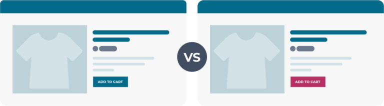
You probably found the pink CTA easier to notice. The easier a user can find their next step on your website, the better. As long as you’re consistent in your branding, a little contrast in button color makes CTAs more compelling. Many top brands use contrast well in their CTAs.
Spooooky Secondaries
A button styled with an outline and plain text is commonly referred to by the nickname “ghost button.” Many top eCommerce companies utilize this button as a “Save for Later” option alongside an “Add to Cart” option.
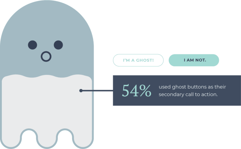
The subtle aesthetic of the ghost button makes it ideal for usage as a secondary call to action. They don’t overwhelm the intended primary action, and they easily to fit in with almost any brand style.
Brand Consistency
Consistency in branding is as important as it gets. Using consistent, prominent brand colors and styling over time develops brand recognition and loyalty.
CTA Verbiage Breakdown
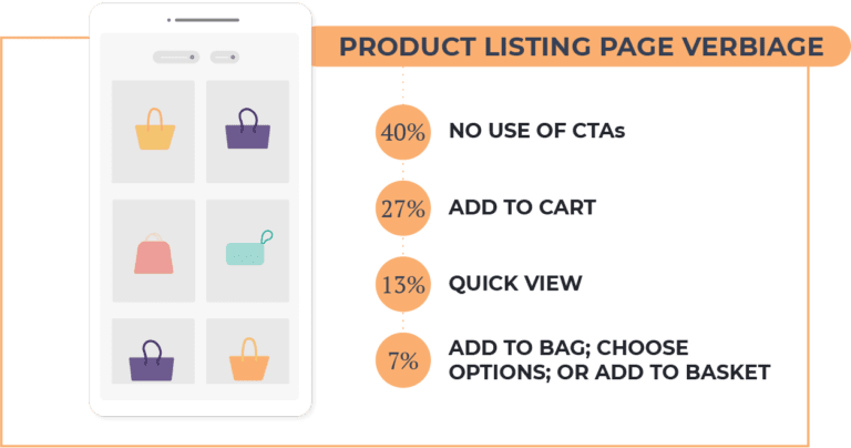
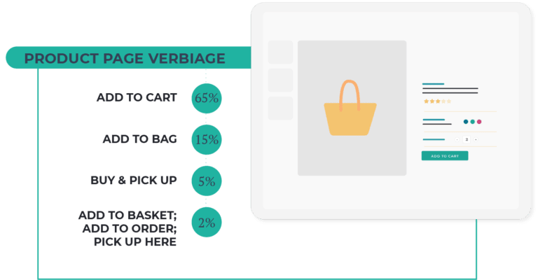
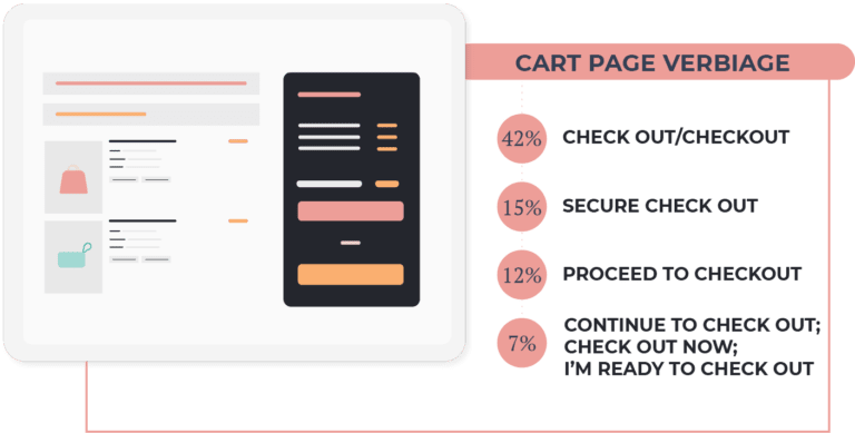
Choice of verbiage shouldn’t be an afterthought when it comes to CTAs. Clear, concise language can propel users to take the next step on your site; while confusing, long CTAs cause confusion and hesitation for users. Below, see the commonalities in verbiage choice on brand product listing pages, product pages, and cart pages.
Count on OuterBox for Your Next Steps
The only way to really know if your site is performing as efficiently as it could be is to test it. How would it perform if you changed your CTA color? How about the verbiage?
If you’re interested in learning more about how OuterBox helps optimize eCommerce sites through UX testing, contact us for a free estimate today.